

20 Feb 10 Website Sins That Drive Away Customers
 If your web traffic is falling flat, dropping off, or non-existent, you may have to take a hard look at the website itself. Web designers and internet gurus know there are cardinal rules to follow for quality web design, but not every website out there was created with these in mind.
Here are 10 website sins that can drive away your customers:
10 Things You Should Never Do With a Business Website
1. No Logo – This says to a potential customer that you may not be a real company. Your logo is part of your identity, do you really want it to be generic web text or nothing at all?
2. Too Much Text – Studies show time and time again that people do not like to read a lot of text. If by chance your audience is more tech-minded and has a need for more information- you should certainly provide it to them; just don’t lead with it. Start with short, simple and basic copy and let them decide how much more information they want to consume with a “Read More”.
3. Flash, Incompatible Technology – If a site doesn’t load properly or components aren’t showing up for the people who visit your site, they’re not going to stick around long enough to wonder why they should do business with you.
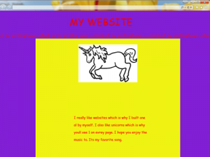
4. Music – Nothing is quite as bad as navigating to a website and being blasted with music. Please leave out the aural assaults. If your business is your music ask permission with a visible play button and call to action.
5. Outdated Appearance – Websites have evolved a LOT since the dawn of the Internet age. If your website looks like it was built by internet cavemen people may wonder if you’re still in business or if you care about investing in your business. A company that doesn’t care about itself certainly doesn’t care about its customers, right?
6. Inconsistent Formatting – Again, this speaks volumes on the professional image of the company. Inconsistent formatting can appear disjointed and though customers may not be able to put their finger on it, it affects their perception of the site – and your business.
7. Comic Sans – Nothing is more unprofessional than the use of Comic Sans. Sure, it may have been fun back in 1995… if you were a kid. Now it’s time to grow up and show your customer you’re serious about your business. You can be fun with your typefaces without using the most horrific and hated one.
8. Clashing Colors – We tend to look away from the things are displeasing to our eyes, clashing colors on a website will most certainly cause this. Purple text on a red background? Just stick to the basics. Using neutral colors as backgrounds and accent colors for added pop is a web design best practice.
9. Personal Taste – It’s all right for you to like unicorns, and it’s understandable your desire to share with the world your love of unicorns. But if you’re a lawyer, you probably don’t want unicorns plastered all over your site. It’s best to just keep it professional. There is an acceptable level of personal taste if it’s fittingly incorporated into your brand – perhaps if you like the color yellow, you can choose a yellow logo.
10. Typos, Spelling Errors, Poor Grammar – If your website is full of typos, spelling errors, or poor grammar, once again people aren’t going to take you seriously. There has to be a certain amount of caution with doing business on the internet as people don’t want to be duped into doing business with a 13 year-old kid with exceptional website skills who flunked English class, or some spammer from overseas. They want to you know you’re real, professional, trustworthy, and serious about your business. If you’re selling a product, they want to know the site is secure and they’re not going to lose a bunch of money. There’s no doubt that the English language is hard – even for us! It’s definitely worth the investment to hire somebody to proofread all of your content. Visit our post on common grammatical errors people make to learn more.
Sometimes it’s easy for the self-starter or small business to get in over their head with technology they don’t understand. There’s an abundance of “easy-to-build” website businesses advertised that make it tempting for people to build their own.
You don’t have to forego a web presence for fear of having a bad one. There are many web design businesses out there that specialize in working with small businesses and are priced for such (like us).
Are you guilty of committing some of these website sins? Contact us today for help!
Sorry, the comment form is closed at this time.